New challenges in the healthcare industry have accelerated the development of medical innovations. Healthcare leaders have shifted to the development of software with a long-term perspective for virtual care: Telemedicine platforms, apps for wearables, and Computer Vision solutions.
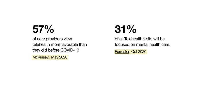
Since the crisis has made many teams overwork, companies across different industries are also looking for corporate software monitoring stress levels and supporting the mental health of their employees.
Striving to improve patient care, hospitals and clinics look for ways of digitizing medical services and internal administrative processes.
While a lot of attention is focused on functionality, the role of UI & UX design in healthcare software often remains undervalued. However, design can help to avoid life-threatening medical errors and improve patient centricity.
What are UI & UX challenges in Healthcare software development?
There are some specific domain peculiarities that you should consider while developing UI/UX design for Healthcare software:
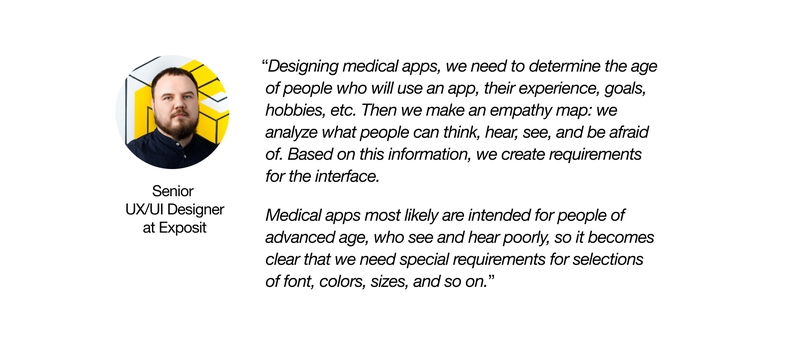
- Medical applications are intended for a wide variety of users: doctors of different specializations, nurses, young and elderly patients, etc. This diversity makes user research an essential step in understanding the needs and specific requirements of the end-users of different groups.
- Today, Healthcare products become a part of our everyday life and are used almost everywhere: in the clinic, in the operating room, in an ambulance, at home, in the street. It makes accessibility under any circumstances a must-have for Healthcare apps.
- The healthcare industry is very dynamic: medical specialists face new practices, treatments, and standards every day. Thus, medical products must be flexible and scalable to address rapid industry changes.
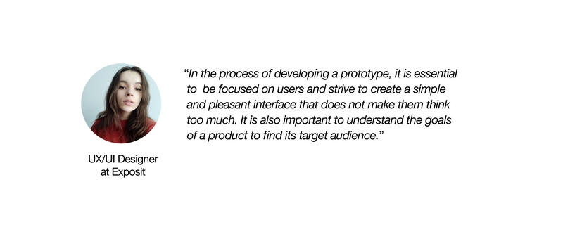
- The medical sphere often requires quick and informative decision-making for saving human life. That’s why it is necessary to keep a Healthcare app understandable, convenient, and easy to use.
Tips for creating patient-centered design
- Colors
Colors play a very important role in healthcare application design. The right choice of color helps you send special signals to patients and put them in the right frame of mind.Clinics often choose white and blue colors for their applications. The white color represents cleanliness and sterility, while the blue color gives peace and tranquility to patients.Another popular color in the healthcare software palette is green. It suggests growth and vitality. Remember that the main color should also match the company’s mission and purpose.Also, make sure that colors are contrasted against the background so that visually impaired users can see everything clearly. Do not forget to pay attention to the illustrations, taking into account the peculiarities of the vision of colorblind people.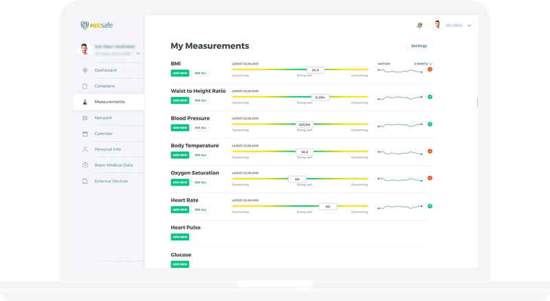
- Typography
When it comes to the text in your app, it is necessary to pay attention not just to the fonts but also to the size of the text. The texts and various clickable elements should also have optimal size for all groups of users to read them easily and accurately. Ensure aged or visually impaired users the ability to clearly see the text. - Navigation
Navigation of healthcare apps should be simple. You can use large buttons, display tooltips, and design all accessibility forms, such as oversized fields and auto-filled fields.Patients should be able to find important information and necessary details within some seconds. Keep in mind a 3-click rule stating: the system should be designed so that any information can be accessed in three transitions. - Speed
Fast loading speed is especially important for medical apps. You should maintain the balance of UI elements and functional features.If you want to make your application work smoothly and quickly, control the number of graphical elements, animations, and amount of text.The main goal of medicine apps is to address patient problems. Thus, Healthcare apps should be fast and deliver the main message to users first.
An excellent example of a healthcare app is arterio: a mobile solution developed by our Team for heart patients. Designing the application, we provided a detailed analysis of our target audience and identified challenges they can face: lack of experience in using software products.
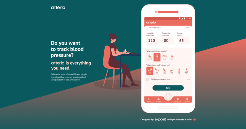
We also paid attention to specific needs of our personas, such as font readability. Thanks to the human-centered approach, the interface of arterio is suitable for all groups of users, including aged people.
Wrap-Up
UI & UX techniques focused on human-centered design can definitely improve the effectiveness of healthcare applications. If you want to satisfy the needs of your end-users, conduct a research on the target audience to better understand your users.
Exposit designers are experienced in creating quality UI&UX design for Healthcare solutions focusing on patient centricity and industry-specific processes.
Drop us a line to create user-focused healthcare solutions that will meet the needs of your patients and meet your administrative, financial, and clinical needs.
